Every autumn, the design industry focuses on the upcoming year, asking which colors and trends will define the next 12 months. Major paint companies release their annual Color of the Year picks, basing these forecasts on changing aesthetics, cultural shifts, and evolving attitudes toward our living spaces.
These selections do more than predict future trends; they have become trendsetters themselves, influencing interiors, architecture, furniture, fashion, and product design. Although each brand approaches the process differently, their combined choices often highlight broader changes in how we perceive color.
For 2027, prominent selections include greens, earthy browns, and muted blues, reflecting a sustained interest in nature, comfort, and spaces that feel personal and well-lived. As these new shades are revealed, we examine the colors making an impact, the reasoning behind each choice, and what they suggest about the year ahead.
Photography courtesy of Valspar
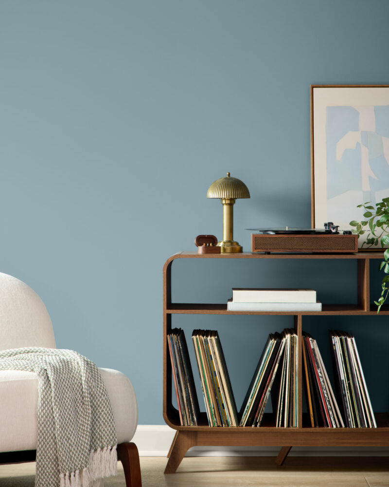
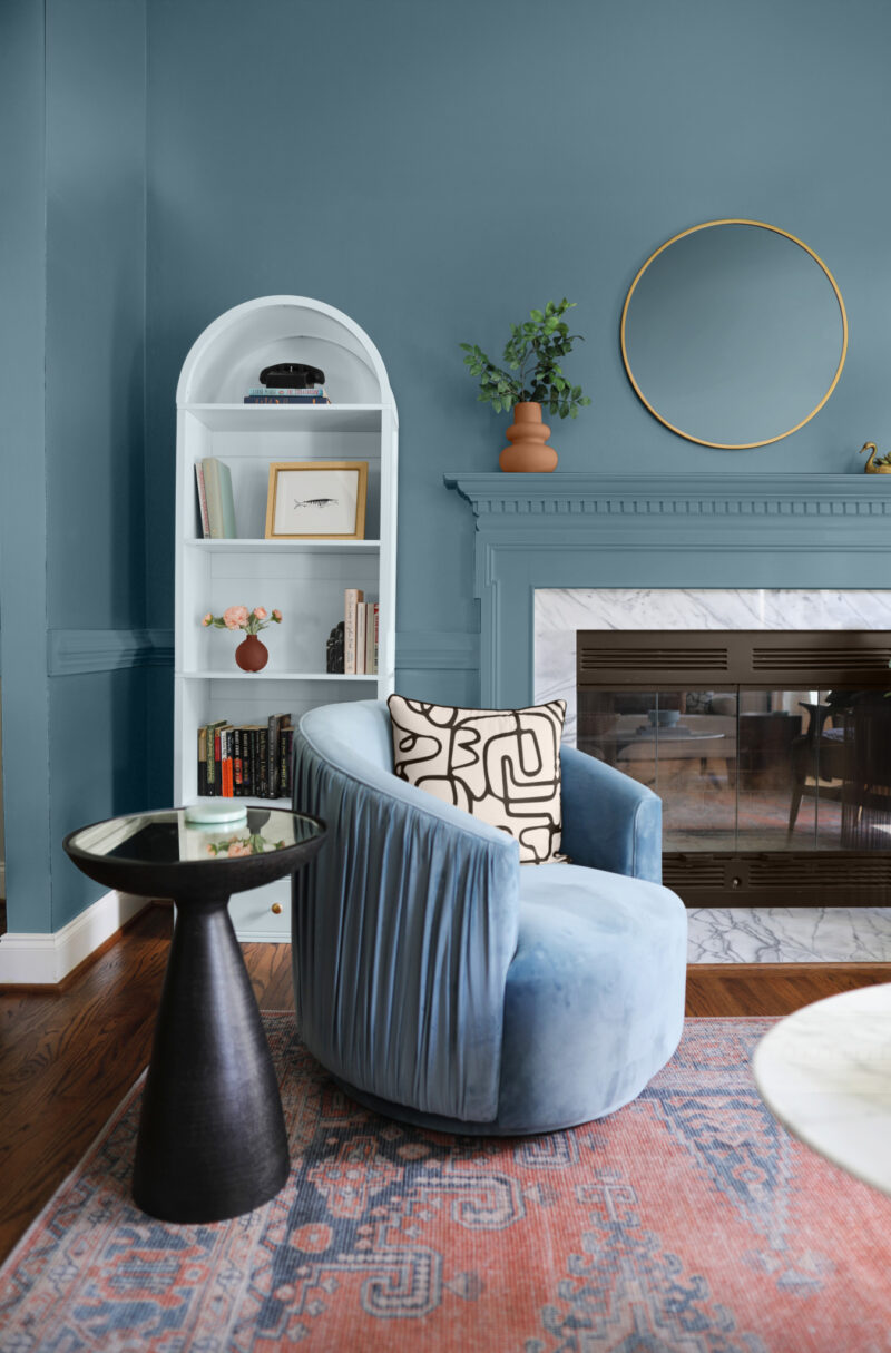
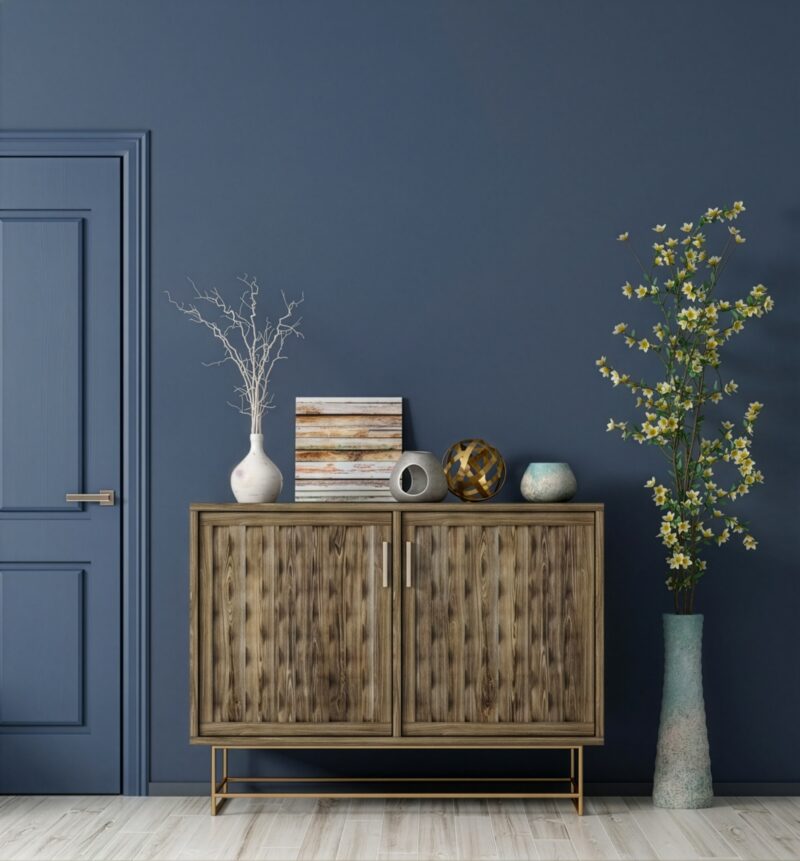
Cottage Door by Valspar
Inspired by the raw beauty of natural materials, Valspar’s Cottage Door brings a sense of familiarity to the home. This muted blue mirrors the growing trend toward intentional living, where design choices serve as a form of self-reflection. Unbound by seasons or fleeting fads, Cottage Door adapts to the natural world’s shifting palettes. Its subtle character embraces imperfection, celebrating the memories and lived-in details that make a space personal.
Read more about Cottage Door here.
Photography courtesy of Behr
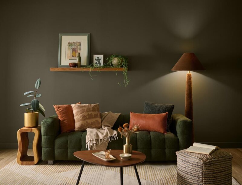
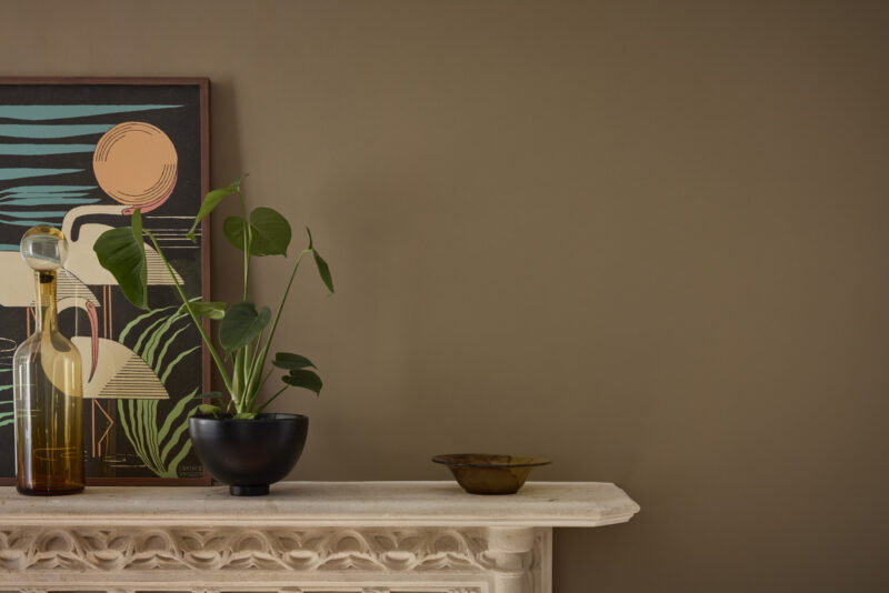
Grounded by Behr
Behr’s 2027 Color of the Year, Grounded, invites the outdoors inside. Combining mossy olive tones with brown undertones, the shade evokes stability. Grounded blurs the boundary between interior design and the natural world, turning living areas into natural sanctuaries.
Read more about Grounded here.
Photography courtesy of Sherwin-Williams
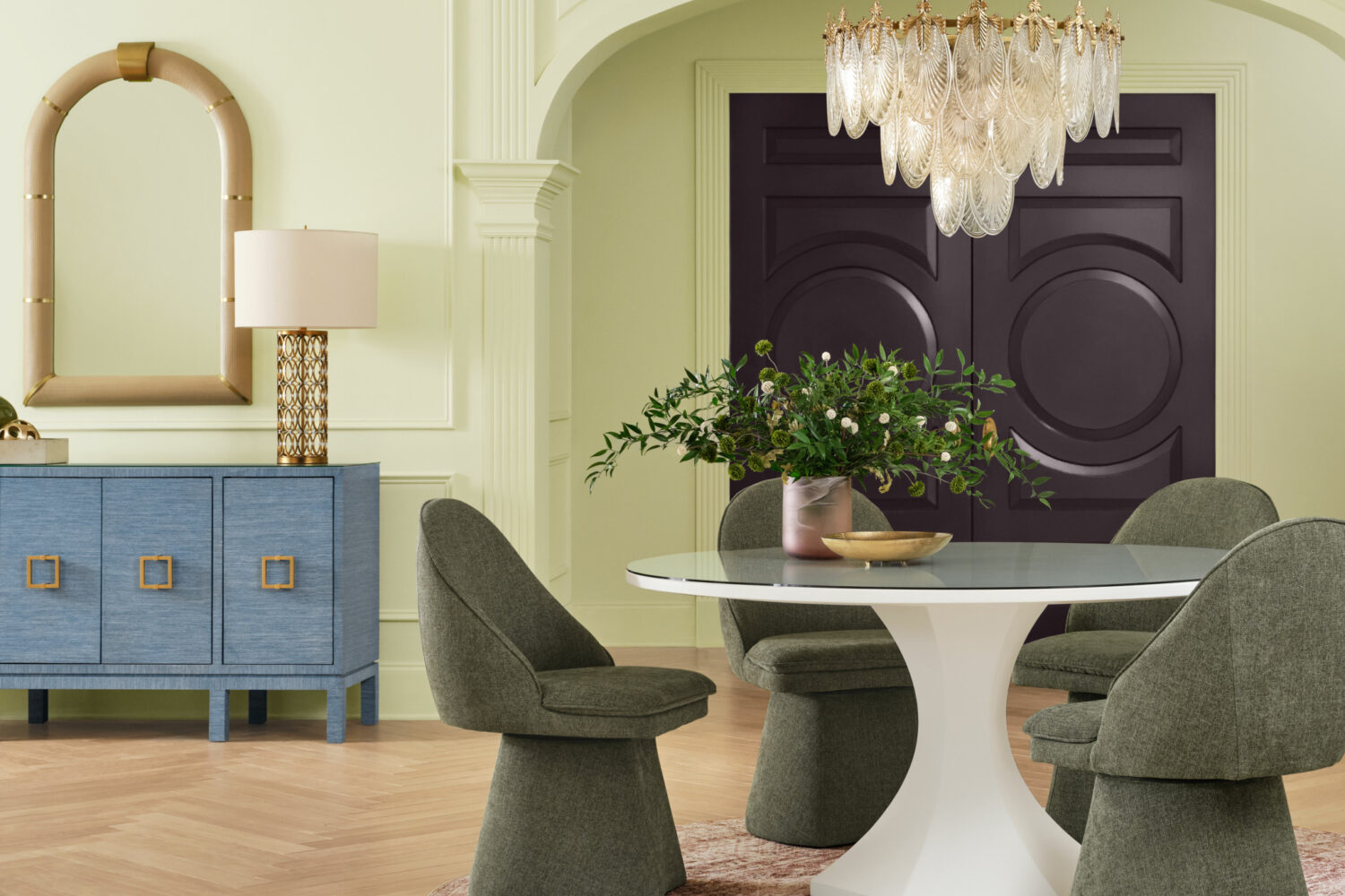
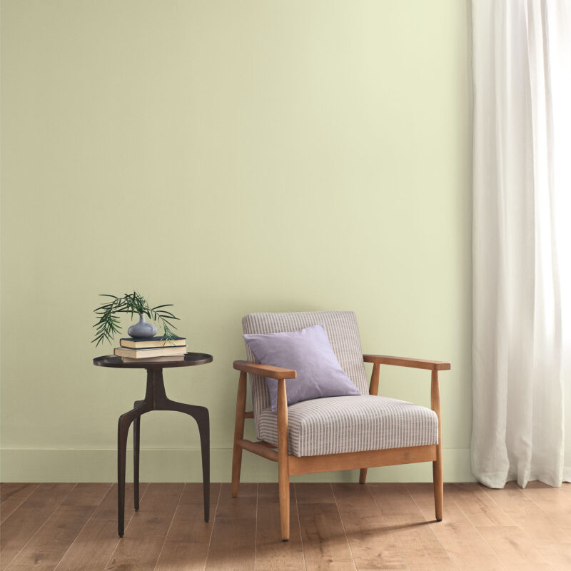
Celery by Sherwin-Williams
Sherwin-Williams’ Celery offers a fresh approach to interiors, fostering an organic and balanced environment within a space. Its airy, pastel hue blends tranquility with vitality, highlighting the connection between interior design and well-being. Whether used as a subtle background or a bold accent, Celery adds a restorative quality to interiors, balancing organic neutrals with contemporary color palettes.
Read more about Celery here.
Photography courtesy of Benjamin Moore
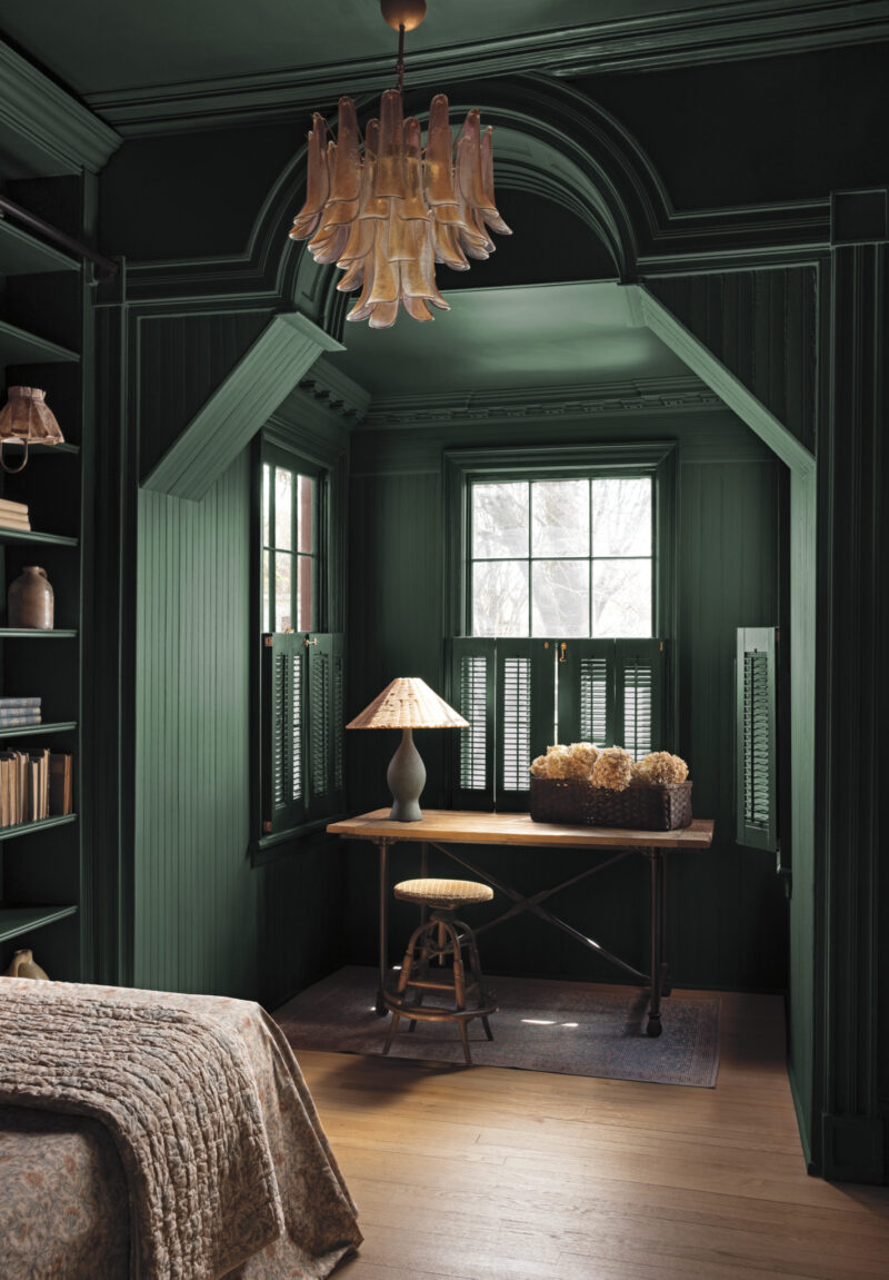
Webster Green by Benjamin Moore
Moving beyond temporary trends, Benjamin Moore’s Webster Green embodies the sophistication of classic design. Balancing tradition with modern appeal, this elegant green reflects the present while looking to the future, adding character to any room.
Read more about Webster Green here.
Photography courtesy of Glidden
Artifact by Glidden
Artifact, Glidden’s 2027 Color of the Year, offers a fresh perspective on interiors through a calm, muted aqua hue. It refreshes the home without requiring a full renovation. As a versatile backdrop for personal expression, Artifact reimagines the minimalist white trend, maintaining simplicity while introducing a delicate wash of color.
Photography courtesy of Little Greene
Marle by Little Greene
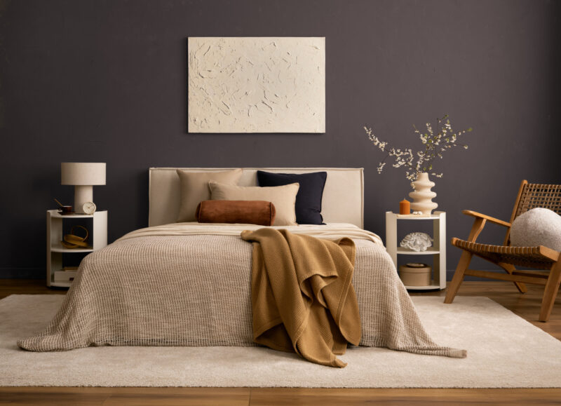
Paint and wallpaper brand Little Greene selected Marle as its 2027 Color of the Year. Mirroring the return of understated browns in fashion and interior design, this earthy hue is designed to foster comfort and soften the surrounding space. Describing the shade as "sumptuous and impactful, yet relaxed and grounded," Little Greene’s Creative Director Ruth Mottershead highlights the balance between richness and restraint that defines the color.
Photography courtesy of California Paints
Quiet Peace by California Paints
California Paints’ Quiet Peace encourages us to slow down and appreciate our surroundings. This deep, moody blue creates a sense of calm while allowing room for self-expression through design. Rather than merely decorating a room, Quiet Peace helps establish a thoughtful relationship between space, color, and the people who inhabit it, offering a welcome refuge from the chaos of the outside world.
Photography courtesy of Dunn-Edwards
French Press Coffee by Dunn-Edwards
Dunn-Edwards announced French Press Coffee as its 2027 Color of the Year, predicting the rise of desaturated, atmospheric hues in the coming year. This silky, rich brown evokes luxury and history, cultivating intimacy through warmth and understated sophistication.
Photography courtesy of Dutch Boy Paints
Deep Rooted by Dutch Boy Paints
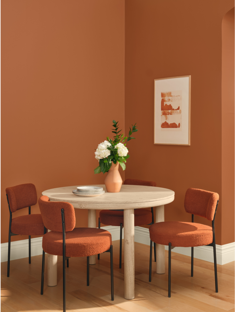
As the name suggests, Dutch Boy Paints’ Color of the Year, Deep Rooted, aims to create a grounded, authentic, and dependable environment within a space. With its earthy terracotta hue and warm undertones, Deep Rooted encourages personalized, lived-in environments.
Photography courtesy of Ace Hardware
Vantage Point by Clark+Kensington
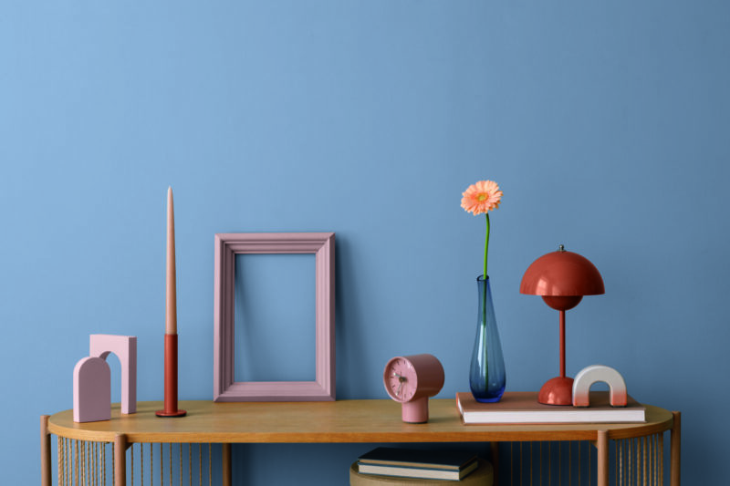
Ace Hardware’s paint brand Clark+Kensington chose Vantage Point, a radiant blue shade that brings a crisp, refreshing perspective to interiors and adds uplifting energy to everyday spaces.
Photography courtesy of Graham & Brown
Rose Earth by Graham & Brown
Inspired by natural minerals and pigments found in Italian clay deposits, Graham & Brown’s Rose Earth connects modern spaces with historical painting practices. This subtle pink, enriched by a warm terracotta undertone, brings centuries-old influences into contemporary interiors.
Photography courtesy of C2
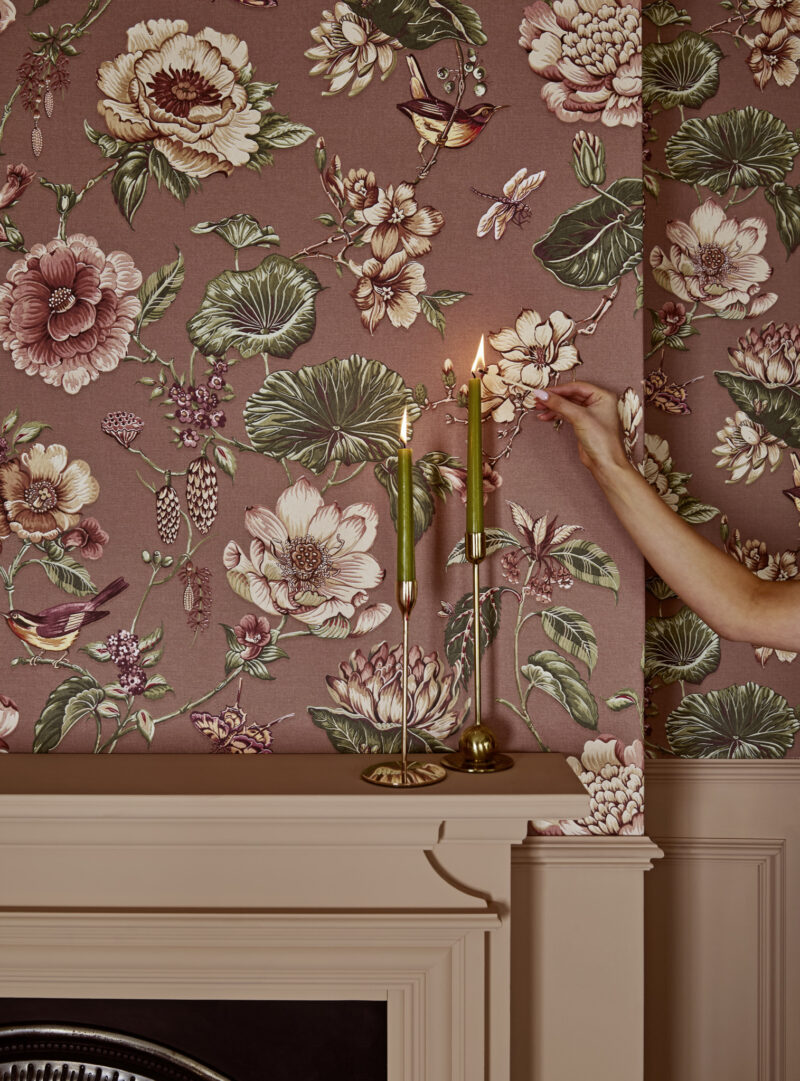
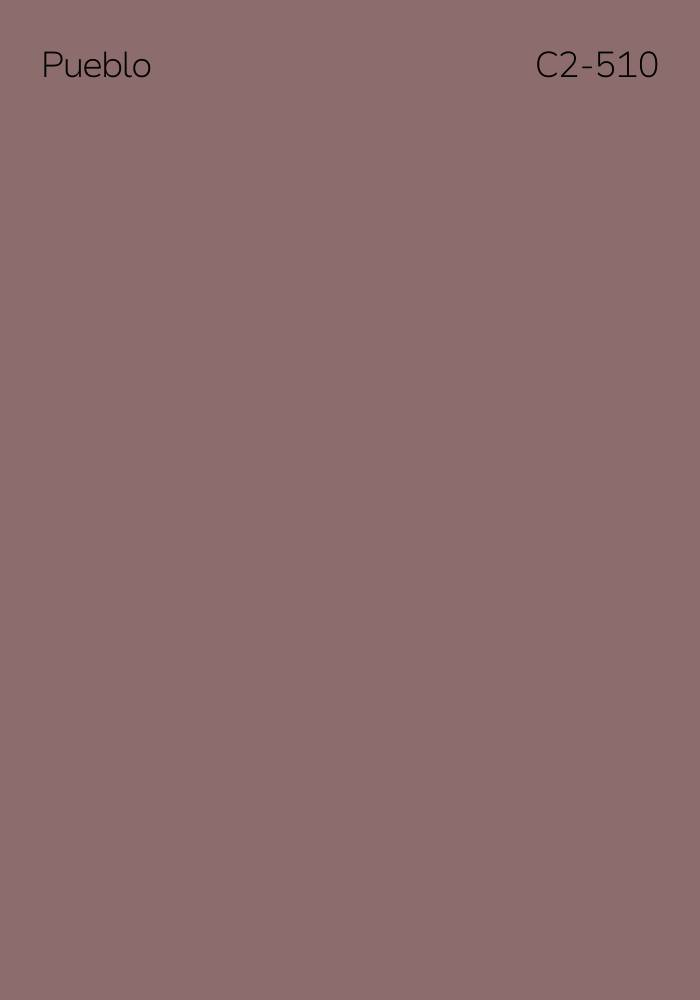
Pueblo by C2
C2’s 2027 Color of the Year, Pueblo, looks beyond simply finding a retreat and explores what it means to feel truly alive within a space. With its earthy pink and mauve tones, Pueblo encourages physical interaction with our surroundings, transforming interiors into spaces where people actively engage with their environment rather than simply retreating from it.




More Similar Articles Like This
Gayton Road Residence by Paxton Locher Studio
2 Comments
Loving Luxury at Mardan Palace Resort, Turkey
Different Types Of Foundations For Summer Houses and Garden Buildings
Stunning Banyan Tree Ungasan Bali in Indonesia
Gorgeous And Spacious Home In Sunset Strip
Extraordinary Constance Halaveli Maldives Resort
2 Comments
Heavenly Lily Beach Resort & Spa In Huvahendhoo, Maldives
5 Ways to Turn Your Yard Into a Fancy Space