
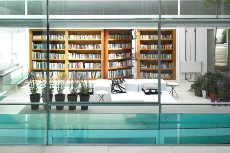
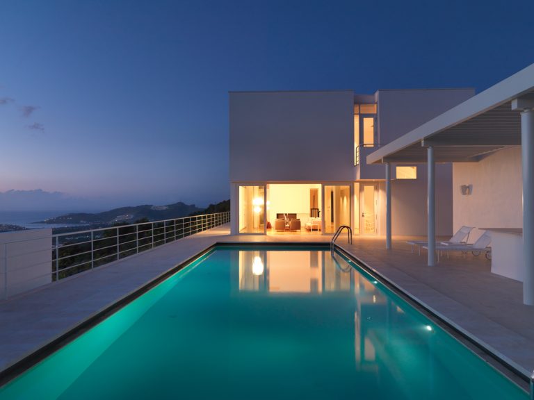
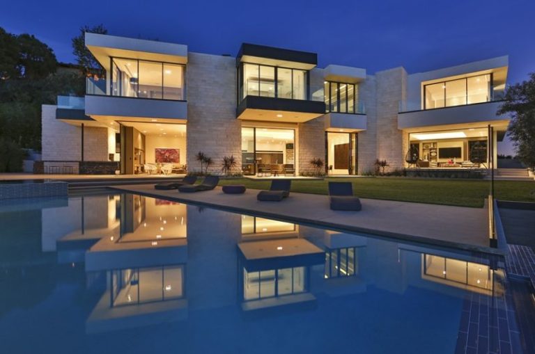
The Shelter Island House in New York was designed by the architects Stamberg Aferiat + Associates. In this case we can say that the line that divides art from architecture is transparent.
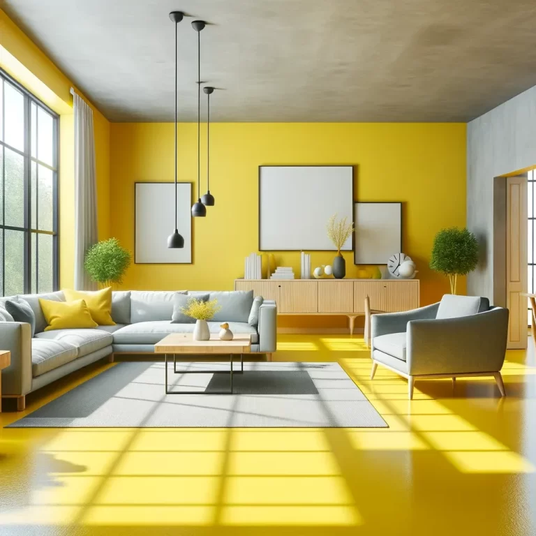
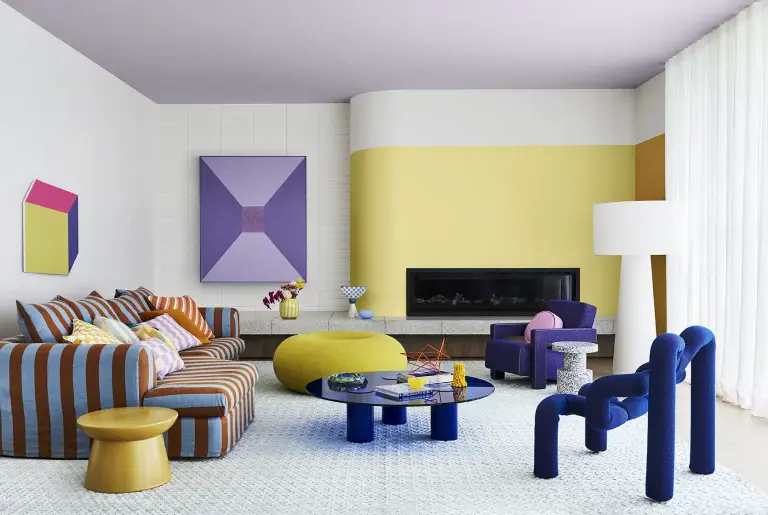
The architects thought that the architecture combined with color can bring plenty of joy while providing basic necessities. Because this construction is very colored and pushes boundaries that few dare, it doesn’t mean that it is not serious.
Based on the Newtonian color theory, the color palette of the house allows the richly-colored reflected light to pass through translucent walls, pampering the spaces with beautiful glow.


Photos by Paul Warchol
































This post beautifully captures how Stamberg Aferiat + Associates blend color and architecture to create a joyful, vibrant space. The thoughtful use of light and color truly brings the Shelter Island House to life—thank you for sharing this inspiring design!
Thank you for your kind words! Stamberg Aferiat + Associates truly excel at harmonizing color and light to create lively, welcoming spaces. We’re glad the Shelter Island House resonated with you.
Absolutely stunning! The interplay of light and color here is mesmerizing. You captured the essence of this architectural masterpiece perfectly. Such a joyful, serious design that truly blurs the line between art and building.
Thank you so much! I’m thrilled you appreciate the interplay of light and color in this project. It was a joy to capture that unique balance between art and architecture. Your kind words mean a lot to the team!